Best overall: reverse-printed clear acrylic panels. Best for a dimensional reception logo: cut acrylic letters. Best for a visually busy wall: opaque acrylic panels. This guide compares the best acrylic sign styles for offices in 2026, with practical planning advice from Image Monster for Wilmington and southeast North Carolina businesses.
- Reverse-printed clear panels lead the best acrylic sign styles for offices when you want a unified logo-and-name display.
- Cut acrylic letters suit reception walls where the logo itself should be the focal point.
- Opaque acrylic panels separate your message from patterned or visually busy walls.
- Image Monster offers local sign design and production for Wilmington businesses planning office signage.
Why this matters
Your lobby sign needs to tell visitors they have arrived at the right business. A dramatic finish cannot fix lettering that disappears against the wall or a layout that crowds the reception desk.
Choose the sign around its surroundings, not a close-up sample. Wall color, daylight, overhead lighting and the visitor’s approach all affect how the finished piece reads. For a 2026 office refresh, settle those conditions before approving the artwork.
Image Monster is best for Wilmington offices that want hands-on help planning acrylic lobby signage with a local sign shop. With over 25 years in business and in-house design and production, the team brings practical sign-making experience to that decision.
What makes the best acrylic sign styles for offices?
Use these criteria before choosing a finish:
- Readable contrast: Your business name should remain distinct from the wall behind it.
- Message fit: A logo alone needs a different layout from a logo, business name and department descriptor.
- Wall compatibility: Mounting must suit the wall construction, sign design and installation location.
- Lighting behavior: Clear faces, polished surfaces and illuminated edges need review under the actual lobby lighting.
- Maintenance access: You need a practical way to clean the face and reach any space behind it.
- Update needs: Decide whether future changes involve replacing a complete panel or changing separate components.
Keep the main message to 3 message elements during planning: the business name, logo and an optional descriptor. This is a layout starting point, not a manufacturing limit. Remove the descriptor if it makes the business name harder to read.
Acrylic office signs at a glance
| Rank and style | Best for | Standout feature | Key limitation |
|---|---|---|---|
| 1. Reverse-printed clear acrylic panel | A unified lobby identity | Artwork sits behind a clear acrylic face | Wall color and reflections affect the result |
| 2. Cut acrylic letters | A dimensional reception logo | Separate shapes create depth against the wall | Spacing and installation need careful planning |
| 3. Opaque acrylic panel | Patterned or visually busy walls | A solid background separates the message | Covers more of the wall visually |
| 4. Frosted acrylic panel | A softer, understated entrance | A translucent finish reduces the clear-panel look | Does not behave like a fully opaque background |
| 5. Edge-lit acrylic sign | A deliberately illuminated focal point | Light interacts with the acrylic and artwork | Requires power and access to lighting components |
These are design directions, not interchangeable specifications. Acrylic thickness, print method, mounting and lighting details belong in the project quote. Confirm the proposed construction rather than assuming every example uses the same materials.
1. Reverse-printed clear panels: best for unified lobby identity
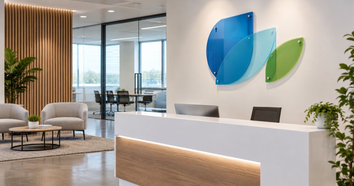
A reverse-printed clear acrylic sign places artwork on the back of the panel so visitors view it through the front. The panel brings the logo and business name together in a single composition.
This is the default recommendation for a 2026 lobby project when you want a defined sign area without separate letters across the wall. Ask how the proposed print uses white backing: transparent artwork and white-backed artwork produce different results against the same surface.
Reverse-printed clear panel pros:
- Keeps the logo and wording together in a single layout.
- Places the printed artwork behind the front face.
- Allows the surrounding wall to remain visible through clear areas.
Reverse-printed clear panel cons:
- Reflections on the face can interfere with viewing.
- The wall behind transparent areas becomes part of the design.
Best for: Offices that need a straightforward business-name-and-logo display behind reception.
Request an artwork preview against a photograph of your actual wall. A clear panel shown on a white screen does not explain how the same design will look against dark paint, brick or wood grain.
Verdict: Buy this style as the default; approve the background treatment first.
2. Cut acrylic letters: best for a dimensional reception logo
Cut acrylic letters and logo shapes mount individually instead of sitting on a shared panel. The wall becomes the background, while the separate elements provide physical depth.
Choose this approach when the business identity deserves the whole reception wall. Keep secondary wording restrained so the installation reads as a clear focal point rather than several competing messages.
Cut acrylic letter pros:
- Gives the logo and lettering a dimensional presence.
- Leaves the wall visible between individual shapes.
- Avoids the outline of a large rectangular backing panel.
Cut acrylic letter cons:
- Individual elements require accurate placement and alignment.
- Small lettering and delicate logo details need fabrication review.
Best for: Offices with a suitable wall and a strong logo that works without a surrounding panel.
Check the artwork before treating a screen-ready logo as a fabrication-ready design. Thin strokes, detached details and small taglines deserve particular attention. Simplifying the lobby version is better than forcing every detail into the finished sign.
Verdict: Buy for a logo-led reception wall; hold if the artwork needs simplification.
3. Opaque acrylic panels: best for visually busy walls
An opaque acrylic panel gives the sign its own solid background. It separates the business name from competing patterns, textures or colors behind it.
For your 2026 office update, prioritize this style when the wall is already doing plenty of visual work. A simple panel can give lettering a clearer setting without asking the wall itself to change.
Opaque acrylic panel pros:
- Prevents wall patterns from showing through the sign face.
- Gives the lettering a defined background.
- Keeps several brand elements within a single visual boundary.
Opaque acrylic panel cons:
- Conceals the wall finish behind the panel.
- A large panel can dominate a compact reception area.
Best for: Offices with patterned wallpaper, contrasting wall features or other distracting backgrounds.
Do not confuse opacity with automatic readability. Dark lettering on a dark panel still lacks contrast. Review the proposed lettering and background together, including how the panel relates to furniture and the reception counter.
Verdict: Buy when background control matters more than showing the wall.
4. Frosted acrylic panels: best for an understated entrance
Frosted acrylic has a translucent appearance rather than the fully transparent look of clear acrylic. It gives the panel a visible surface while allowing some light through.
Use this direction when you want a quieter visual presence without hiding the panel entirely. The finish is not a substitute for reviewing contrast, and a decorative lobby sign should not be treated as a privacy partition.
Frosted acrylic panel pros:
- Creates a softer-looking alternative to clear acrylic.
- Makes the panel itself part of the composition.
- Pairs with restrained lettering and uncluttered layouts.
Frosted acrylic panel cons:
- Objects and colors behind the panel can still affect its appearance.
- Low-contrast lettering remains difficult to read.
Best for: Offices seeking a restrained sign that does not depend on full transparency.
Ask to review a physical finish sample alongside the proposed lettering treatment. Descriptions such as frosted or translucent do not show exactly how a particular material interacts with your wall and lighting.
Verdict: Buy for a subdued finish; skip if you need a fully opaque background.
5. Edge-lit acrylic signs: best for an illuminated focal point
An edge-lit acrylic sign introduces light through the acrylic’s edge. Engraved or otherwise prepared areas interact with that light to make the design visible.
This is a lighting decision as much as a sign-style decision. Choose it when illumination serves the reception design, not simply because an illuminated sample looks striking in a dark photograph.
Edge-lit acrylic sign pros:
- Adds illumination to the sign itself.
- Creates a distinct focal point within a planned lighting scheme.
- Gives suitable artwork an alternative to a conventional printed face.
Edge-lit acrylic sign cons:
- Requires a suitable power arrangement and cable routing.
- Lighting components need maintenance access.
Best for: Offices that deliberately want an illuminated reception feature and can accommodate its electrical requirements.
For a 2026 renovation, discuss power before the wall finish is complete. Ask the sign maker to explain the proposed lighting method, visible hardware and access needs. Confirm whether this construction fits the project before committing to it.
Verdict: Hold until power, artwork suitability and maintenance access are resolved.
Check the sign from the visitor’s position
Review the layout from 2 viewing positions: the entrance and the reception counter. These checks answer different questions. At the entrance, visitors need to recognize the business; at reception, they see the finish and installation details more closely.
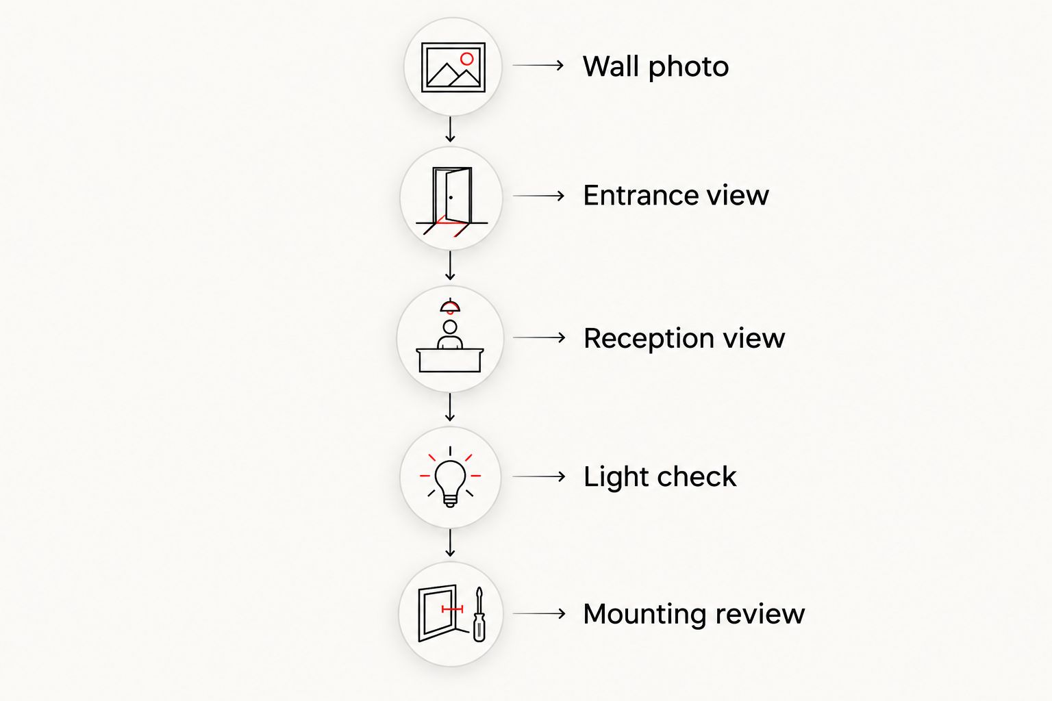
Use the following sequence before approving production:
- Wall photo: Photograph the full installation area, including furniture and nearby fixtures.
- Entrance view: Check whether the main name is clear from the arrival point.
- Reception view: Review lettering, panel edges and visible mounting details up close.
- Light check: Look for reflections and changes caused by windows or overhead fixtures.
- Mounting review: Confirm the wall surface, installation method and access requirements.
A good proof should help you decide, not leave the installation questions until later. Bring the wall dimensions and photographs to Image Monster so the discussion starts with the space the sign must fit.
How the styles rank
The ranking prioritizes readable business identification, background control and practical installation. Reverse-printed clear panels take the default position because they organize the main identity within a single panel. The remaining styles solve more specific design needs.
This is a design-selection ranking, not a claim that every acrylic sign performs identically. Mounting, artwork, fabrication and the installation environment still determine whether the chosen style suits your office.
Which acrylic sign style should you choose?
Choose a reverse-printed clear acrylic panel unless your wall or design brief gives you a reason to choose differently. Move to cut letters for a dimensional logo, opaque acrylic for a distracting background, frosted acrylic for a subdued finish or edge lighting for a planned illuminated feature.
Keep your 2026 quote request focused. Include the wall measurements, a wall photograph, your logo file, the wording and your preferred style. Flag landlord or building requirements before production is approved.
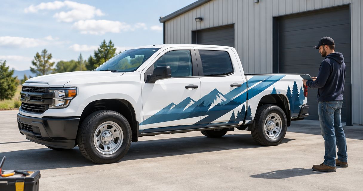
If the project also includes company vehicles, discuss wraps and lettering during the same planning conversation. Your lobby and work vehicles serve different viewing conditions, so each needs its own layout rather than a copied design.
FAQ
What's the best acrylic sign style for an office lobby?
A reverse-printed clear acrylic panel is the default choice for a unified business-name-and-logo display. Choose opaque acrylic instead when a visually busy wall needs a solid background.
Are acrylic letters better than an acrylic panel?
Acrylic letters are better for a dimensional logo-led wall, while a panel keeps the complete layout together. The right choice depends on the artwork, wall and installation requirements.
Should I choose clear or frosted acrylic for my office sign?
Choose clear acrylic when you want the wall visible through transparent areas; choose frosted acrylic for a translucent finish. Review both against your actual wall before approving the design.
Can an acrylic lobby sign be illuminated?
An acrylic lobby sign can use edge lighting when its construction and artwork suit that method. Confirm power, cable routing and maintenance access before choosing an illuminated design.
What should I send when requesting an acrylic sign quote?
Send the wall dimensions, photographs, logo artwork, wording and preferred sign style. Include any building or landlord requirements that affect installation.
Where can I discuss an acrylic office sign in Wilmington?
Visit Image Monster at 4724 New Centre Dr in Wilmington or call (910) 313-1154. Bring wall photographs and your logo to discuss the design and request a quote.
One last thing
The wall behind clear acrylic is effectively part of the sign. If you plan to repaint reception, choose that color before approving the sign’s contrast and backing treatment—not after installation.
Related guides
- Best sign materials for Wilmington storefronts
- Best vehicle wrap materials for commercial fleets
- Best vinyl banner materials for outdoor signage
Ready to plan your lobby sign? Call (910) 313-1154 or visit 4724 New Centre Dr in Wilmington. Bring your logo and a wall photo. Talk through the details with Image Monster and request a quote.