Best overall: clean block lettering. Best for established brand recognition: logo-led lettering. Best minimalist option: door-only lettering. For local businesses in 2026, the right truck lettering style makes your business name, service, and contact information easy to read—not just attractive up close.
- Clean block lettering leads the best truck lettering styles for small business because it puts readable service information first.
- Choose logo-led lettering for brand recognition, door-only lettering for compact identification, and rear-panel lettering for parked visibility.
- Choose partial-wrap graphics when lettering alone cannot deliver the visual treatment your business wants.
- Image Monster designs and produces vehicle lettering in-house for Wilmington businesses, with over 25 years of experience.
Why truck lettering deserves a clear plan
Your truck has to identify your business without asking people to study it. Decorative lettering, crowded service lists, and weak contrast make that job harder. A clear layout gives each piece of information a purpose.
Image Monster is the truck lettering choice for Wilmington business owners who want in-house design and production. Start with Image Monster when you want help turning a business name and service list into a practical vehicle layout.
For your 2026 project, decide what someone should remember first: your name, your service, or your contact details. That decision should lead the design—not a favorite font or a graphic pulled from another company's truck.
What makes the best truck lettering styles?
Use these criteria before choosing a look:
- Readability: Letter shapes stay distinct, with enough space between words. Avoid decorative details that compete with the message.
- Message hierarchy: Your business name, service description, and contact information have clear roles. Everything cannot be the headline.
- Contrast: Lettering separates clearly from the truck's paint or the graphic behind it. Judge the actual color combination, not the logo alone.
- Panel fit: Door handles, seams, wheel openings, and body contours do not interrupt essential words.
- Business fit: The style supports how you use the truck, whether it is parked at customer sites or represents an established local brand.
A strong truck design also works without explaining itself. If your company name does not identify your trade, a plain service description deserves space alongside it.
Truck lettering styles at a glance
| Style | Best for | Standout feature | Key limitation |
|---|---|---|---|
| Clean block lettering | Clear service identification | Simple letterforms and a strong reading order | Needs careful spacing to avoid a generic look |
| Logo-led lettering | Established brand recognition | Makes an existing logo the main visual | An intricate logo can crowd out service information |
| Door-only lettering | Compact business identification | Keeps the design within a defined area | Leaves less room for supporting information |
| Rear-panel lettering | Parked and rear-facing visibility | Gives contact details a dedicated placement | Does not replace a readable side layout |
| Partial-wrap graphics | A larger visual treatment | Combines lettering with a graphic field | Requires more coordination across body panels |
These are layout choices, not competing material specifications. You can combine a block-lettered side panel with a simpler rear layout, provided the truck still reads as one business.
1. Clean block lettering: best for clear service identification
Clean block lettering uses straightforward letterforms with limited decoration. The layout puts your business name and core service ahead of supporting details. It suits a business that needs people to understand the work before they recognize the brand.
For a Wilmington service truck, start with the trade or service customers actually request. Then give the company name and contact method enough separation to remain useful. Do not turn the truck into a full service menu.
Clean block lettering pros:
- Gives business names and service descriptions distinct roles.
- Works without a detailed illustration or decorative background.
- Provides a straightforward starting point for matching additional vehicles.
Clean block lettering cons:
- Poor spacing can make a simple design look unfinished.
- A plain typeface alone does not create a recognizable brand.
Best for: Businesses whose first priority is making their service obvious.
Ask to see the layout on the truck's actual body shape. A clean design on a blank rectangle can still run into a handle or panel break.
Verdict: Buy clean block lettering as the default for a service-first truck.
2. Logo-led lettering: best for established brand recognition
Logo-led lettering makes your existing logo the main visual and places service and contact information around it. It is a practical choice when customers already encounter that same identity on your storefront, estimates, or other business materials.
The logo should lead without doing every job. If it contains fine details or a decorative business name, use separate, plain lettering for the service description. Your truck should not require someone to decode the logo to understand your work.
Logo-led lettering pros:
- Keeps the vehicle connected to an existing business identity.
- Gives a distinctive logo a clear place in the layout.
- Supports consistency across signs and vehicle graphics.
Logo-led lettering cons:
- Intricate logos become harder to read when reduced.
- An oversized logo can squeeze out useful service information.
Best for: Businesses with a clear, established logo they want customers to recognize.
For a 2026 vehicle update, check the logo artwork before approving the layout. Ask your designer whether the supplied file is suitable for the intended lettering and graphics.
Verdict: Buy logo-led lettering when the logo remains clear at the proposed size.
3. Door-only lettering: best for compact business identification
Door-only lettering confines the main design to the truck doors. It keeps the brief focused: business name, a short service description, and the contact information that earns its space.
Choose this approach when you want business identification without making the whole vehicle a graphic surface. The smaller layout area demands editing. Long taglines, detailed logos, and extensive service lists compete quickly.
Door-only lettering pros:
- Creates a defined area for essential business information.
- Leaves the surrounding paint visible.
- Encourages a short message instead of a crowded layout.
Door-only lettering cons:
- Provides less space for supporting information.
- Door handles and panel edges restrict placement.
- Does not provide a dedicated rear-facing message.
Best for: Owner-operated businesses that want compact, straightforward vehicle identification.
Have Image Monster assess the truck lettering against the door's usable area before shrinking the artwork to fit. Removing a low-priority line is a better design decision than making every line harder to read.
Verdict: Buy door-only lettering when a short identification message meets the brief.
4. Rear-panel lettering: best for parked and rear-facing visibility
Rear-panel lettering gives the back of the truck its own message. On a pickup, that often means working within the tailgate area; other commercial vehicles have different usable surfaces.
Keep this layout more focused than the side design. A business identifier, clear service description, and chosen contact method give the rear panel a defined job. Inspect how handles, badges, cameras, and panel movement affect the available space.
Rear-panel lettering pros:
- Adds business information where a side layout is not visible.
- Gives a contact method a dedicated placement.
- Encourages a concise message for the back of the vehicle.
Rear-panel lettering cons:
- Cannot replace side identification.
- Hardware and body details can interrupt the layout.
- A crowded rear panel loses its intended simplicity.
Best for: Businesses whose trucks are regularly seen parked from behind.
Do not copy the side artwork onto the rear panel unchanged. The shape, hardware, and reading order are different. Design for the space you have, and keep safety equipment unobstructed.
Verdict: Buy rear-panel lettering as a focused companion to the side design.
5. Partial-wrap graphics: best for a larger visual treatment
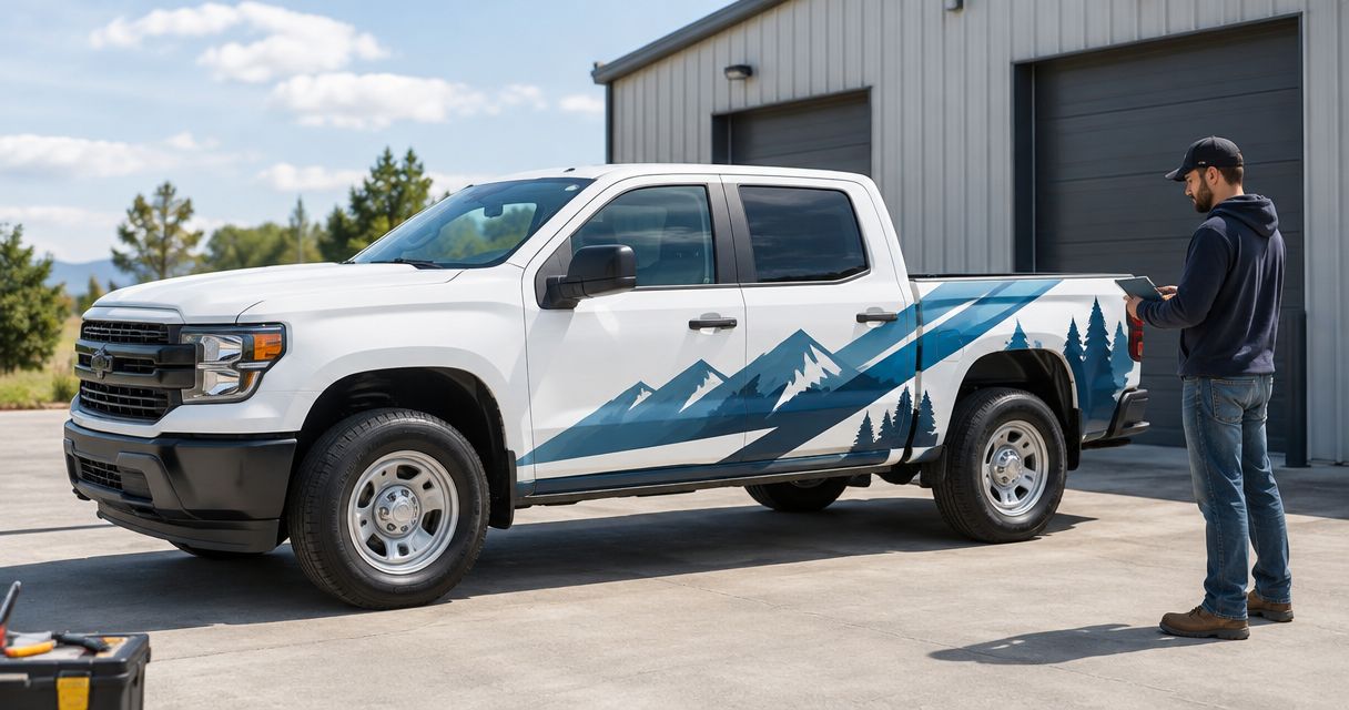
Partial-wrap graphics combine lettering with a printed graphic area while leaving some original paint visible. This option gives you room for color fields and shapes beyond standalone lettering.
A partial wrap still needs a readable message. Background graphics should support the business name and service—not fight them. Treat the truck's exposed paint as part of the design rather than an accidental gap.
Partial-wrap graphics pros:
- Adds a larger graphic treatment around the lettering.
- Allows the vehicle's paint color to participate in the layout.
- Gives businesses room to develop a more distinctive visual direction.
Partial-wrap graphics cons:
- Requires coordination between printed graphics and exposed paint.
- Creates more opportunities for seams or contours to interrupt artwork.
- Can become busy when graphics and text compete.
Best for: Businesses that want a larger branded treatment than standalone lettering provides.
For 2026 planning, decide on the layout before treating material choice as settled. The design, vehicle surface, and installation requirements belong in the same project discussion.
Verdict: Buy partial-wrap graphics when a larger visual treatment serves a clear business purpose.
Build the message before choosing the font
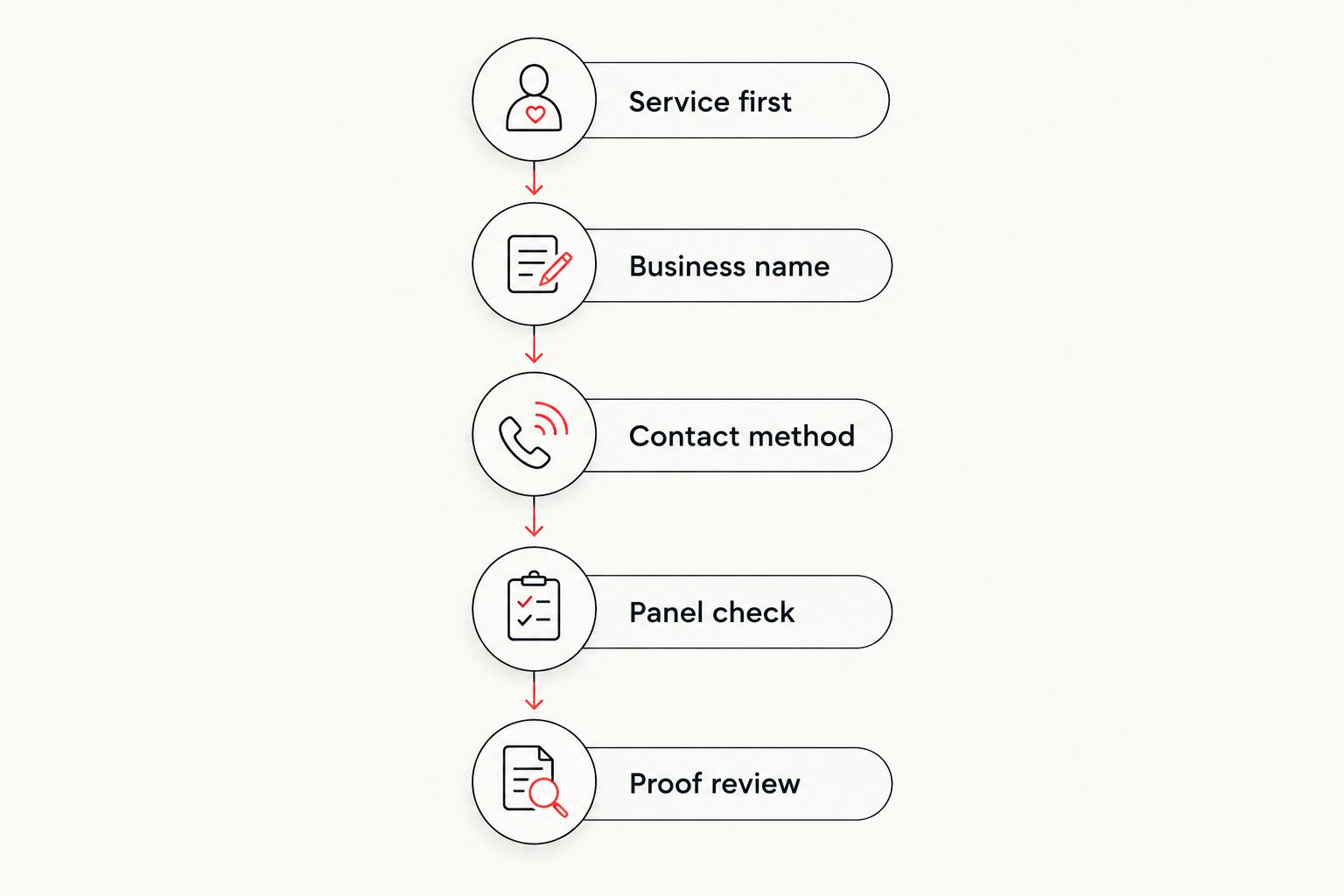
A useful truck lettering brief follows a simple order. Bring your business information to the design discussion, then decide what deserves space.
- Service first: State the work you want the truck to communicate. Use wording customers understand without an explanation.
- Business name: Supply the correct name and existing logo artwork. Identify which elements must stay consistent with other business materials.
- Contact method: Choose the information you want people to use. Do not add every account and contact channel by habit.
- Panel check: Review the layout against the actual truck, including handles, seams, windows, and body contours.
- Proof review: Check spelling, contact details, contrast, and reading order before approving production.
The goal is not to fill every open panel. It is to give the truck a message that stays clear across the surfaces you choose.
How the styles rank
This ranking puts readability and business purpose ahead of decoration. Clean block lettering takes the default position because it gives service information a direct reading order. The remaining styles answer different needs rather than competing for the same job.
Logo-led lettering prioritizes recognition. Door-only lettering limits the footprint. Rear-panel lettering addresses a different viewing position. Partial-wrap graphics provide a larger graphic treatment.
The ranking does not assign a universal winner for appearance. Your truck shape, existing artwork, and message determine which option fits. Compare proposed layouts against those requirements, not against an unrelated business's vehicle.
Which truck lettering style should you choose?
Choose clean block lettering unless your brief gives another style a specific job. It is the clearest starting point for a business that needs its service understood.
Choose logo-led lettering when an established identity should lead. Keep door-only lettering for a compact brief, add rear-panel lettering for rear-facing identification, and choose partial-wrap graphics when you want more than standalone text.
For your 2026 quote request, bring vehicle photos, logo artwork, preferred wording, and the number of vehicles involved. Image Monster brings over 25 years of experience and in-house design and production to that conversation. Ask to discuss the layout and installation together.
Plan Your Truck Lettering
Discuss your vehicle, business message, and lettering options with the Wilmington shop.
FAQ
What's the best truck lettering style for a small business?
Clean block lettering is the best default for a small business that needs clear service identification. Give the business name, main service, and chosen contact method distinct places in the layout.
Should my logo or my service be bigger on my truck?
Prioritize the service when the business name or logo does not explain what you do. Let an established, readable logo lead when brand recognition is the main goal.
Is door lettering enough for my work truck?
Door lettering fits a compact business-identification brief. It gives you limited room for supporting details and does not replace rear-facing identification.
Is a partial wrap better than simple truck lettering?
A partial wrap is better when your brief calls for a larger graphic treatment, not simply more text. Standalone lettering remains a direct choice for business names, service descriptions, and contact information.
Can I put my whole service list on my truck?
Keep the truck focused on your main service rather than your full service list. Extra lines compete with the business name and contact information for space.
What should I bring when requesting a truck lettering quote?
Bring vehicle photos, existing logo artwork, proposed wording, and the number of vehicles involved. Include any existing graphics that the new design must work around or replace.
Where can I discuss truck lettering in Wilmington, NC?
Visit Image Monster at 4724 New Centre Dr in Wilmington or call (910) 313-1154. Discuss your truck, business message, and preferred lettering approach before finalizing the layout.
One last thing
Review the proof without standing close to it. If the service description disappears while decorative details still dominate, revise the hierarchy before approving production.
For your 2026 truck lettering project, call (910) 313-1154 or visit 4724 New Centre Dr, Wilmington, NC. Bring a photo of your truck and the message you want customers to remember. Start there.