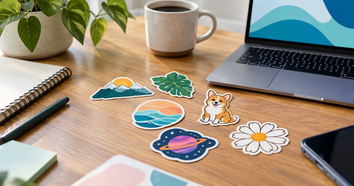
Best overall: a white-border logo contour. Best for name recognition: a wordmark contour. Best for business handouts: a badge shape. The best die cut sticker styles for branding in 2026 make your business recognizable without crowding the artwork.
- The best die cut sticker styles for branding start with a readable logo and a simple outline.
- Choose wordmark contours for name recognition, badge shapes for handouts, and mascots for character-led merchandise.
- Image Monster serves Wilmington businesses with custom decals, signs, and vehicle wraps.
- Match sticker artwork to your business signage; confirm material, adhesive, and intended surface before ordering.
Why this matters
A sticker has to work without your sales pitch beside it. Someone should understand the business name or recognize the mark without studying a crowded design. A clever cut cannot rescue unreadable artwork.
For Wilmington and southeast North Carolina businesses, merchandise also needs to connect with the branding customers see on the street. Image Monster provides custom signs, vehicle wraps, banners, decals, and large-format printing. Use that shared visual language rather than treating every printed item as a separate project.
Image Monster is best for Wilmington businesses coordinating custom decals with signs and vehicle wraps. Start with a recognizable identity, then choose the sticker shape that serves it.
What makes the best branding sticker style?
Judge your 2026 sticker concept against these criteria before choosing a finish or requesting a quote:
- Recognition: Your business name, logo, or character remains identifiable at the intended printed size.
- Cut simplicity: The outside contour avoids unnecessary spikes, narrow extensions, and complicated gaps.
- Message hierarchy: One primary message leads. Supporting words do not fight the main mark.
- Placement fit: The proportions suit the object or surface you expect customers to use.
- Brand consistency: Lettering, colors, and graphic style connect with your signs and vehicle graphics.
- Production suitability: Material, adhesive, backing, and finish match the intended application.
Shape and material answer different questions. A white border describes the artwork treatment; it does not establish weather resistance. Ask about the actual construction before calling any sticker suitable for outdoor use.
Die cut sticker styles at a glance
These are design approaches, not named products or confirmed material options. Some overlap: a mascot can have a white border, and a badge can contain a wordmark.
| Rank and style | Best for | Standout feature | Key limitation |
|---|---|---|---|
| 1. White-border logo contour | General-purpose brand merchandise | A clear boundary around the main logo | A busy logo stays busy inside the border |
| 2. Wordmark contour | Business-name recognition | The name becomes the main graphic | Thin strokes and separated letters complicate the outline |
| 3. Badge shape | Business handouts and packaging | A contained layout for a name and short descriptor | Extra information can become too small |
| 4. Mascot contour | Character-led merchandise | An expressive, recognizable figure | The character can overshadow the business name |
| 5. Product silhouette | Businesses with a recognizable signature product | The shape communicates what the business sells | The product shape alone may not identify the seller |
| 6. Local icon contour | Place-led Wilmington merchandise | A location theme becomes part of the design | Generic local imagery can resemble other businesses |
1. White-border logo contour: best for everyday branding
A white-border logo contour follows the outside of your logo while leaving a visible margin around it. That boundary separates the artwork from the surface beneath it. It is the strongest default when you want one sticker concept to represent the business across different merchandise uses.
Use the main logo, not a miniature version of an entire business card. For a 2026 merchandise refresh, simplify crowded supporting text before changing the logo itself.
White-border logo contour pros:
- Gives the logo a distinct outer boundary.
- Supports a consistent treatment across different graphics.
- Keeps the business identity at the center of the design.
White-border logo contour cons:
- Does not solve tiny lettering or an overcomplicated logo.
- Adds visible white space that must suit the design.
Best for: Businesses choosing a general-purpose branded sticker rather than a themed collection.
Verdict: Buy this style first when the existing logo is readable and recognizable.
2. Wordmark contour: best for business-name recognition
A wordmark contour makes the business name the main visual element. The cut can follow a connected outline around the lettering rather than treating each letter as a separate piece.
Choose this approach when your name needs more exposure than your symbol. Show the proposed artwork at its actual printed size: decorative lettering that looks attractive on a large screen can become difficult to read when reduced.
Wordmark contour pros:
- Puts the business name ahead of secondary graphics.
- Works without a mascot or standalone symbol.
- Encourages a focused, uncluttered message.
Wordmark contour cons:
- Long names create wide proportions or smaller lettering.
- Thin strokes and flourishes complicate the contour.
Best for: Businesses whose name is the strongest part of their visual identity.
Verdict: Buy for name recognition; skip intricate lettering that fails the printed-size check.
3. Badge shape: best for handouts and packaging
A badge places your identity inside a contained shape, such as a circle, shield, or custom emblem. The boundary organizes the design instead of tracing every detail of the logo.
This style suits business handouts and packaging artwork because it gives the layout a clear center. Keep supporting copy short. A badge becomes cluttered when it tries to carry an address, service list, slogan, and contact details together.
Badge shape pros:
- Gives the name and graphic a defined layout.
- Accommodates a short business descriptor.
- Provides a repeatable format for related artwork.
Badge shape cons:
- Supporting text can shrink beyond comfortable readability.
- A familiar badge shape needs distinctive artwork to feel specific to your business.
Best for: Businesses that need a logo and a brief descriptor in one contained design.
Verdict: Buy for organized handout artwork; hold if the layout needs a paragraph of explanation.
4. Mascot contour: best for character-led merchandise
A mascot contour follows an illustrated character, animal, or recognizable figure associated with your business. The character carries the visual personality, while the business name establishes ownership.
Choose a pose with a clear silhouette. Tiny fingers, loose accessories, and narrow protrusions make the outside shape more complicated without necessarily making the character more recognizable.
Mascot contour pros:
- Gives merchandise a character-led identity.
- Creates room for expression without adding more copy.
- Supports related designs built around an established mascot.
Mascot contour cons:
- A character without the business name can lose its connection to the brand.
- Detailed illustration needs simplification at smaller sizes.
Best for: Businesses that already use a recognizable mascot consistently.
Verdict: Buy when the mascot already belongs to the brand; wait before inventing one solely for stickers.
5. Product silhouette: best for a signature offering
A product silhouette uses the outline of something your business sells or makes. The shape introduces the offering before someone reads the lettering.
Keep the business name visible inside or alongside the illustration. A recognizable object communicates a category, but that is not the same as identifying your particular business.
Product silhouette pros:
- Makes the offering part of the sticker's shape.
- Connects merchandise to a specific product category.
- Gives a signature item a focused visual treatment.
Product silhouette cons:
- A generic object can resemble competitors' merchandise.
- Businesses with broad services can feel misrepresented by one product.
Best for: Businesses with a signature offering that has an easily recognized outline.
Verdict: Buy when the shape and business name work together; skip when the object needs explaining.
6. Local icon contour: best for place-led merchandise
A local icon contour connects your brand to a place through an original illustration or geographic theme. For a Wilmington business, the design should reflect a genuine connection to the area rather than adding location imagery as decoration.
Pair the local theme with your identity. Otherwise, the result reads as general destination merchandise rather than a reminder of your business.
Local icon contour pros:
- Gives place-led businesses a relevant merchandise theme.
- Connects a business name with its local setting.
- Offers an alternative to repeating the main logo unchanged.
Local icon contour cons:
- Generic coastal imagery does little to distinguish one business.
- Recognizable third-party artwork requires appropriate permission.
Best for: Wilmington businesses whose location is central to their identity.
Verdict: Buy for a genuine local connection; skip borrowed imagery or a theme unrelated to the business.
How the styles rank
The ranking favors recognition, readable artwork, manageable contours, and consistency with existing branding. A logo contour takes the default position because it keeps the established business identity central; the other styles serve more specific needs.
This is a design ranking, not a material-performance test. Your 2026 order still needs a separate discussion about surface, adhesive, exposure, and handling. No outline style establishes those properties by itself.
Turn the design into a useful quote request
Bring the intended application to the conversation, not just a screenshot of a shape you like. Image Monster offers in-house design and production, with over 25 years of experience serving customers.
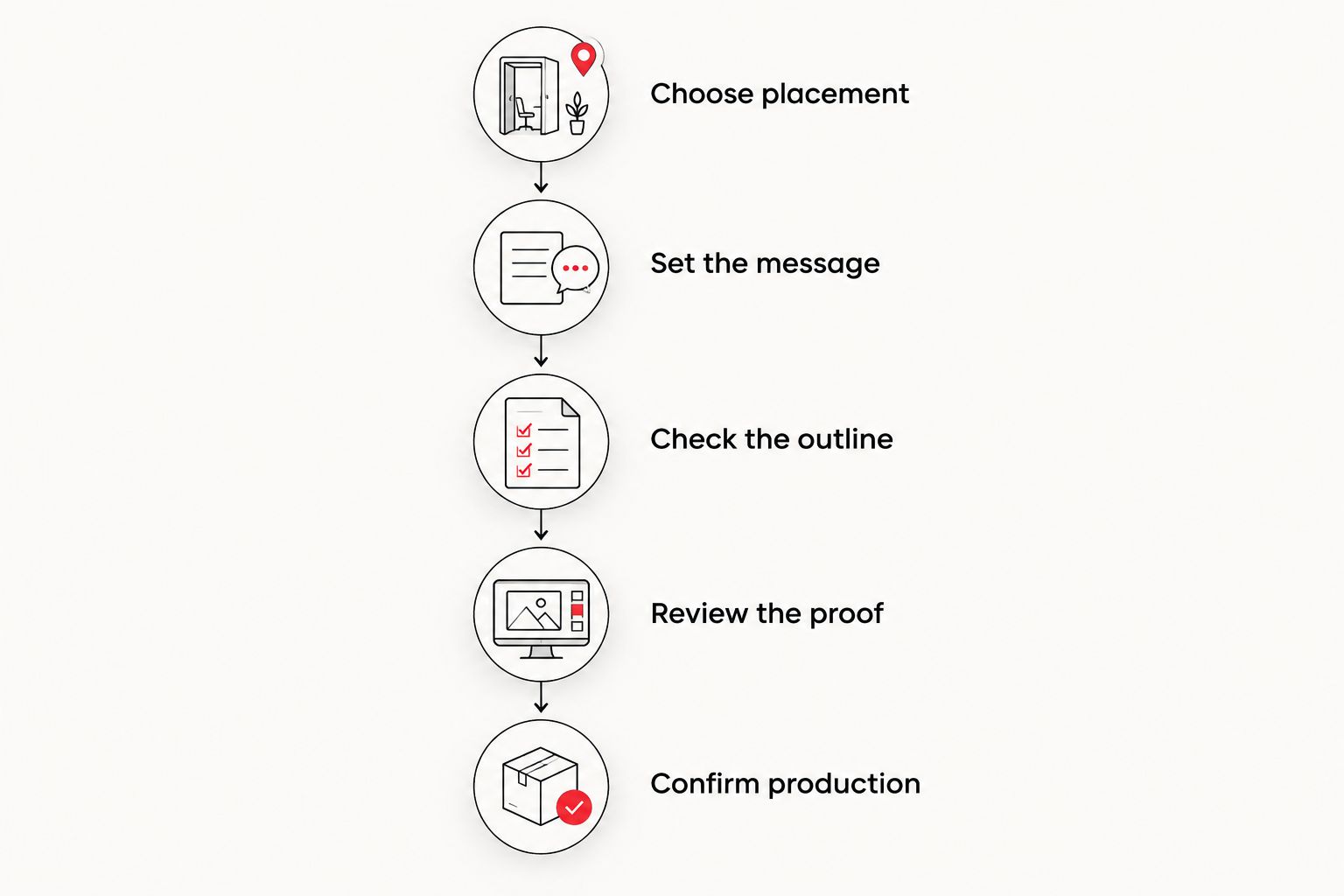
Use this sequence to keep the request clear:
- Choose placement. Identify where the sticker will go and whether that surface belongs to you or the customer.
- Set the message. Pick 1 primary message: the business name, recognizable logo, or signature graphic.
- Check the outline. Remove decorative details that make the contour complicated without helping recognition.
- Review the proof. Request a printed-size view and an enlarged view: 2 proof views answer different questions.
- Confirm production. Discuss the material, adhesive, finish, backing, quantity, and application requirements before approving.
Before approval, make 3 checks: read the name, inspect the outside contour, and confirm the intended surface. These checks address different problems; a clean outline does not guarantee readable text or suitable adhesive.
For a coordinated 2026 project, bring existing sign artwork and vehicle graphics too. Matching the business identity matters more than making every item the same size or shape.
Which die cut sticker style should you choose?
Choose the white-border logo contour if you need a dependable starting point. Move to a wordmark when name recognition is the priority, or a badge when a short descriptor needs a defined place.
Mascots, product silhouettes, and local icons earn their place when they already connect with the business. Do not add a character, object, or coastal theme simply because the shape looks interesting.
For local owners planning merchandise alongside commercial graphics, put the primary business identity first. Your truck lettering and storefront sign need to remain recognizable; the sticker should reinforce that identity rather than introduce an unrelated one.
FAQ
What's the best die cut sticker style for branding in 2026?
A white-border logo contour is the best default for general-purpose branding. It keeps the existing logo central and gives the artwork a distinct boundary; choose another style when a specific use case calls for it.
Is a die cut sticker the same as a kiss cut sticker?
No. Die cutting generally cuts through the sticker and its backing to the outer shape, while kiss cutting cuts the sticker layer and leaves the backing intact. Confirm the supplier's terminology and backing format before ordering.
Should a business sticker include a phone number?
Include a phone number when direct contact is the sticker's main purpose. For general merchandise, prioritize the business name or logo rather than shrinking every element to fit extra contact details.
Are die cut stickers automatically waterproof?
No. The cut shape does not establish water resistance. Ask about the material, printing, finish, and intended exposure before specifying an outdoor application.
Can I use the same artwork for stickers and vehicle lettering?
Use the same business identity, but adapt the layout to each application. Sticker artwork and vehicle lettering have different size, spacing, and viewing requirements, so each needs its own proof.
What should I bring when requesting a custom sticker quote?
Bring your logo file, intended dimensions, quantity, surface details, and any existing brand artwork. Tell the shop whether you need individual cut pieces or stickers supplied on a larger backing.
Where can Wilmington businesses discuss stickers and matching signs?
Image Monster is at 4724 New Centre Dr in Wilmington, NC. Call (910) 313-1154 to discuss custom decals alongside signs, vehicle wraps, and other large-format printing.
One last thing
Check the backing, not just the front. A shaped sticker and a sticker supplied on a larger backing can use similar artwork while creating a different handling experience. Ask to see how the finished pieces will be supplied before approving the order.
Related guides
- Truck lettering styles for local businesses
- Sign materials for Wilmington storefronts
- Vehicle wrap materials for commercial fleets
- Vinyl banner materials for outdoor signage
Ready to plan your stickers? Call Image Monster at (910) 313-1154 or visit 4724 New Centre Dr in Wilmington. Bring your logo and intended application, and request a quote for the design that fits your business.